Challenge 1: Fridgepack Refresh
Challenge 1: Fridgepack Refresh
| School: | Michigan State University |
| Team: | Menglin Hao, Jiaxin(Tina) Tao |
Admittedly, the current Coca-Cola 12-can Fridge Pack is indeed a very successful packaging design. The smart structural design idea, less material, and special taking-out experience are very commendable shining points.
However, after a lot of user experience, there are still several inadequacies that can be improved better:
1. the empty box wastes refrigerator space after using more than half of the quantity.
2. after taking out the seventh can, the next five cans lost their previous interesting taking-out experience.
3. the remaining quantity after the seventh can is not very easy to check.
4. the design of the carrying position is not willing to be used in actual circumstances.
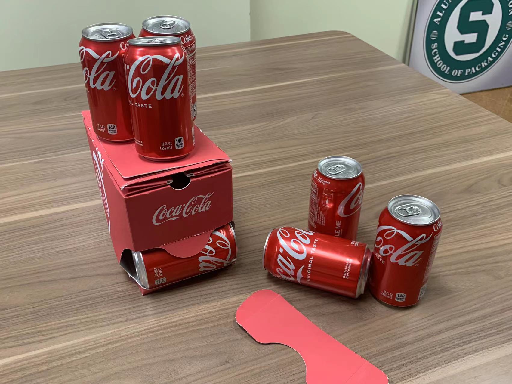
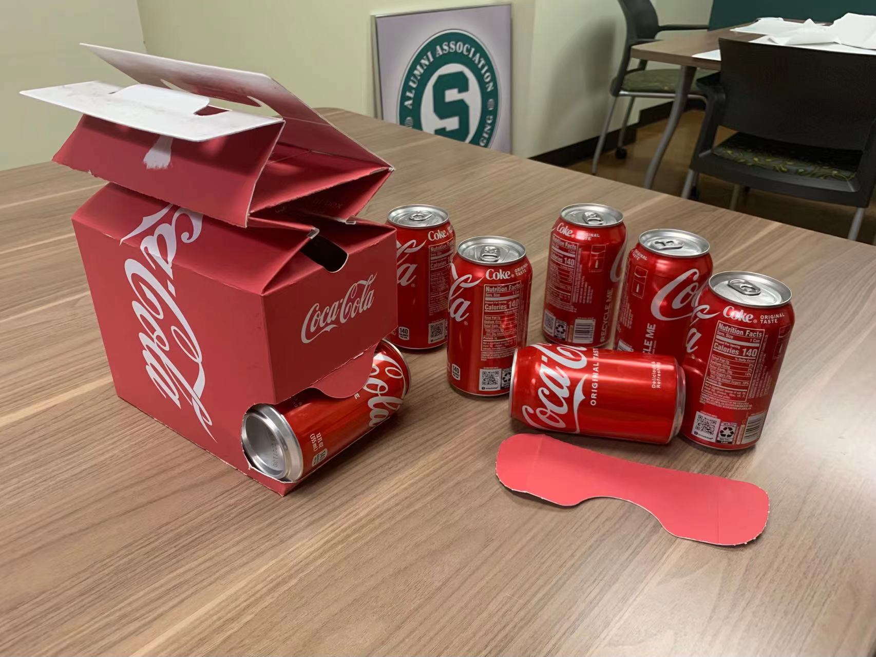
In response to the above inadequacies, we have improved the structure while maintaining the same materials and printing colors.
1. rearrange the cans and take them out from the lower position of the box, the first ten cans will be achieved with a similar taking-out experience, and taking the last two cans can take out the whole box directly.
2. the design of observable holes to confirm the remaining quantity during use.
3. when no cans are found in the hole, the top of the box can be pressed, then the top half box will be collapsed to save the refrigerator space.
4. the top panel of the box is set with a handle hole, which can be glued together with the top of the box with a dot glue during production, transportation, and sale process; after consumers' purchase, they can pull it off and carry the whole box.
The above are the structural improvements we figured out during 48 hours for Coca-Cola’s 12-can Fridge Pack.


