Souleil: Speak Your Truth Serum
Souleil: Speak Your Truth Serum
| School: | California Polytechnic State University: San Luis Obispo |
| Team: | Hailey Choi, Amy Foo, Julianne Hom, Evan Kim, Abby Yee |
Due to recent global events and increased connectivity through the internet, ecommerce has risen in popularity. Business-to-Consumer transactions in turn increased, creating packaging challenges such as safely shipping small, fragile items such as cologne, powder compacts, and smartphones to consumer’s homes around the world. In an age where skincare has become a defining sector of the cosmetic industry, the demand for a variety of creams, serums, cleansers, and similar products has skyrocketed. Beauty retailers employ direct channels to send products to consumers and often seek out effective packaging that not only protects the product, but also enhances the consumer’s overall experience.
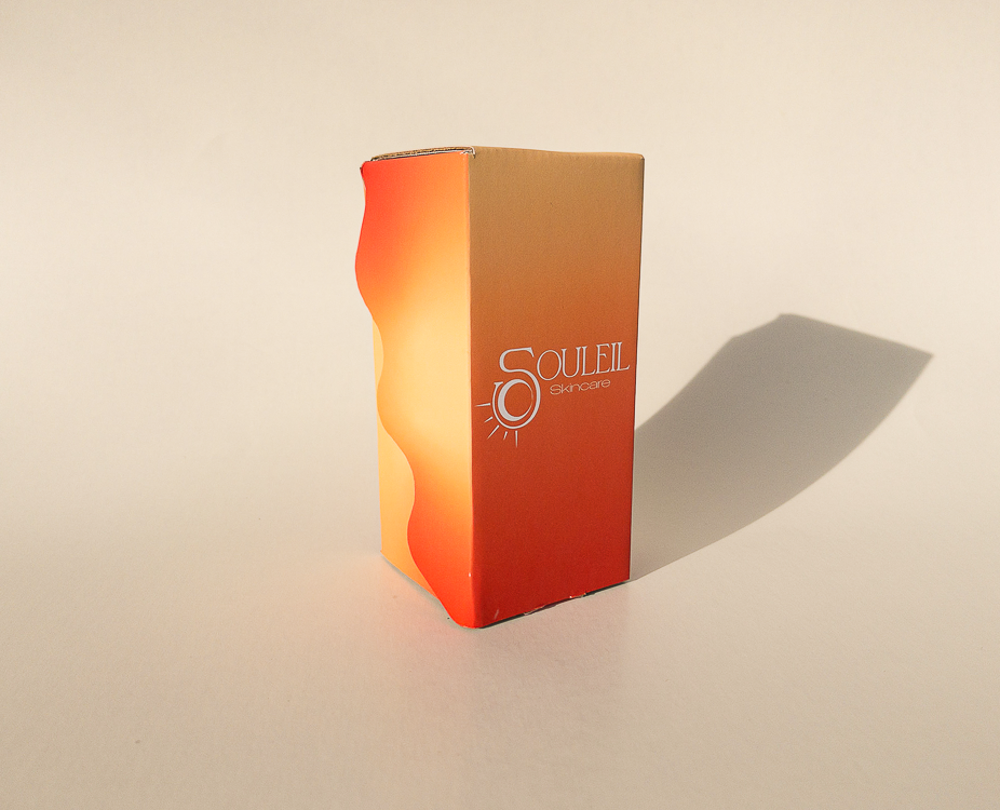
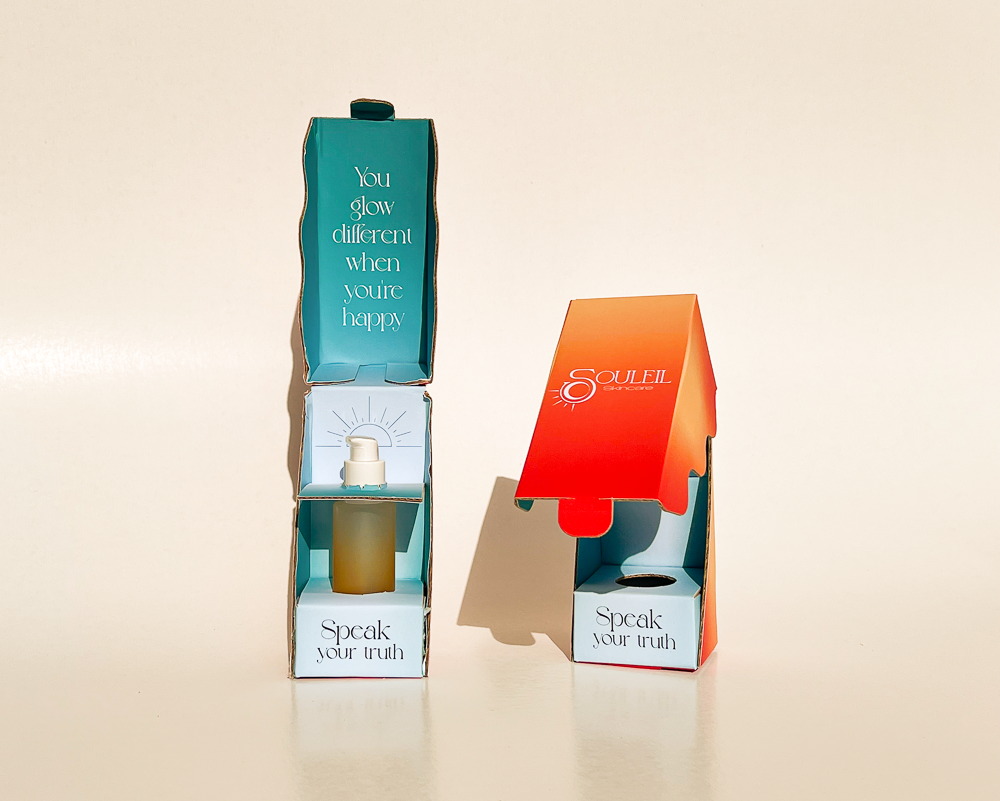
Souleil is a product to brighten your skin from sunrise to sunset, presented in an immersive unboxing experience. Souleil is a brand new product line that focuses on rehabilitation and brightening solutions for facial skincare.
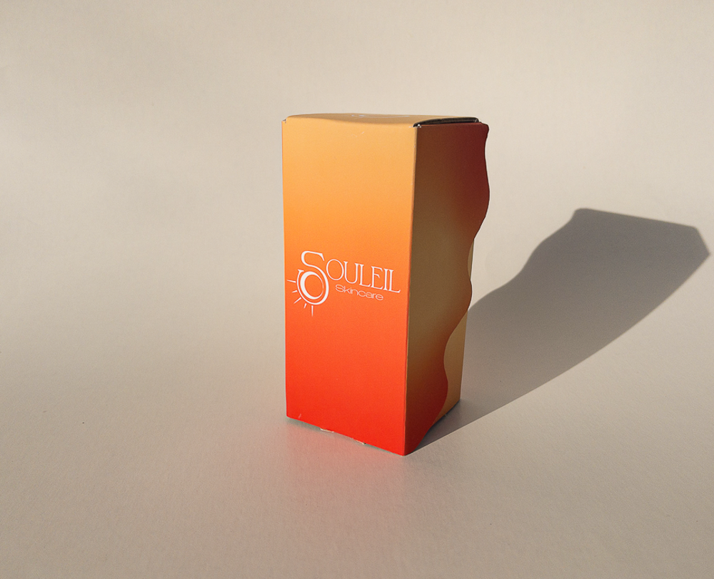
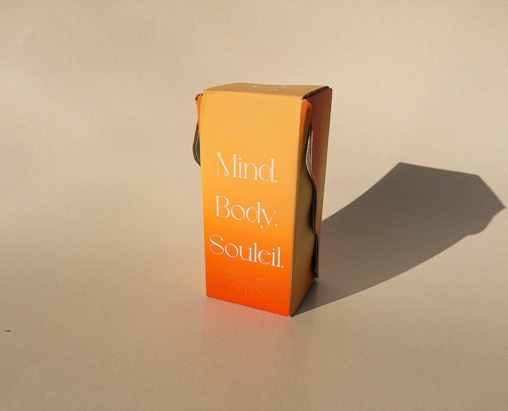
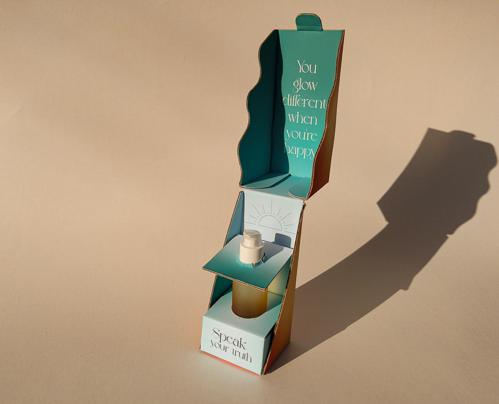
This ecommerce shipper is truly unlike any other; its wave-like cutout design flows seamlessly onto the box’s side panels, introducing a sense of newness to a standard shipper. Our team designed a solution that secures the skincare product in two places with secure-fitting perforated inserts. This feature enables the product to endure movement from all six degrees of freedom without the use of additional protective primary packaging, while also maintaining the integrity of the display function and allowing the consumer to easily remove the product. After the shipper is opened, the consumer can reuse the package by first separating the top section and then utilizing the bottom portion to store the serum or other items such as makeup brushes. In this design, we aimed to improve sustainability by using 100% corrugated board and minimizing material from a standard shipper with a single dieline that utilizes blank space well and can be recycled.
The graphics mirror the essence of our brand: to be a part of a daily and nightly skin care regime. The soft gradient of orange, red, and yellow on the exterior symbolizes the glow of the sunrise, while the teal ombre on the interior mimics the clear bright sky. The warm tones remind consumers of a skin’s healthy glow in contrast to the cool tones that communicate calmness and refreshment for their complexion. These contrasting colors represent balance, supporting our brand’s values of selfcare. Around the exterior are elegant line illustrations that are coupled with motivational quotes in the interior, and overall a calming ambience with small elements of visuals sprinkled throughout the shipper.