Twin-Paks
Twin-Paks
| School: | Virginia Tech |
| Team: | Konnor Rafferty, Rosa Williams, Kyle Main, Shak Kataev, Isaac Quesada-Guzman |
Proposition:
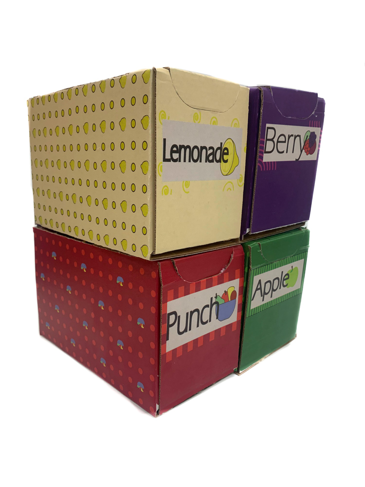
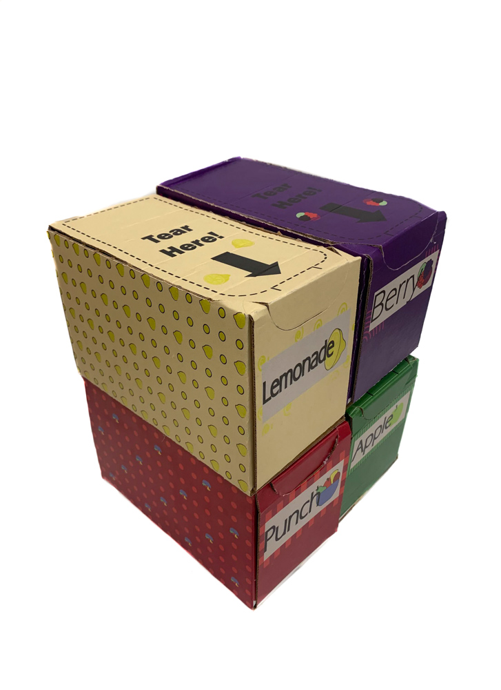
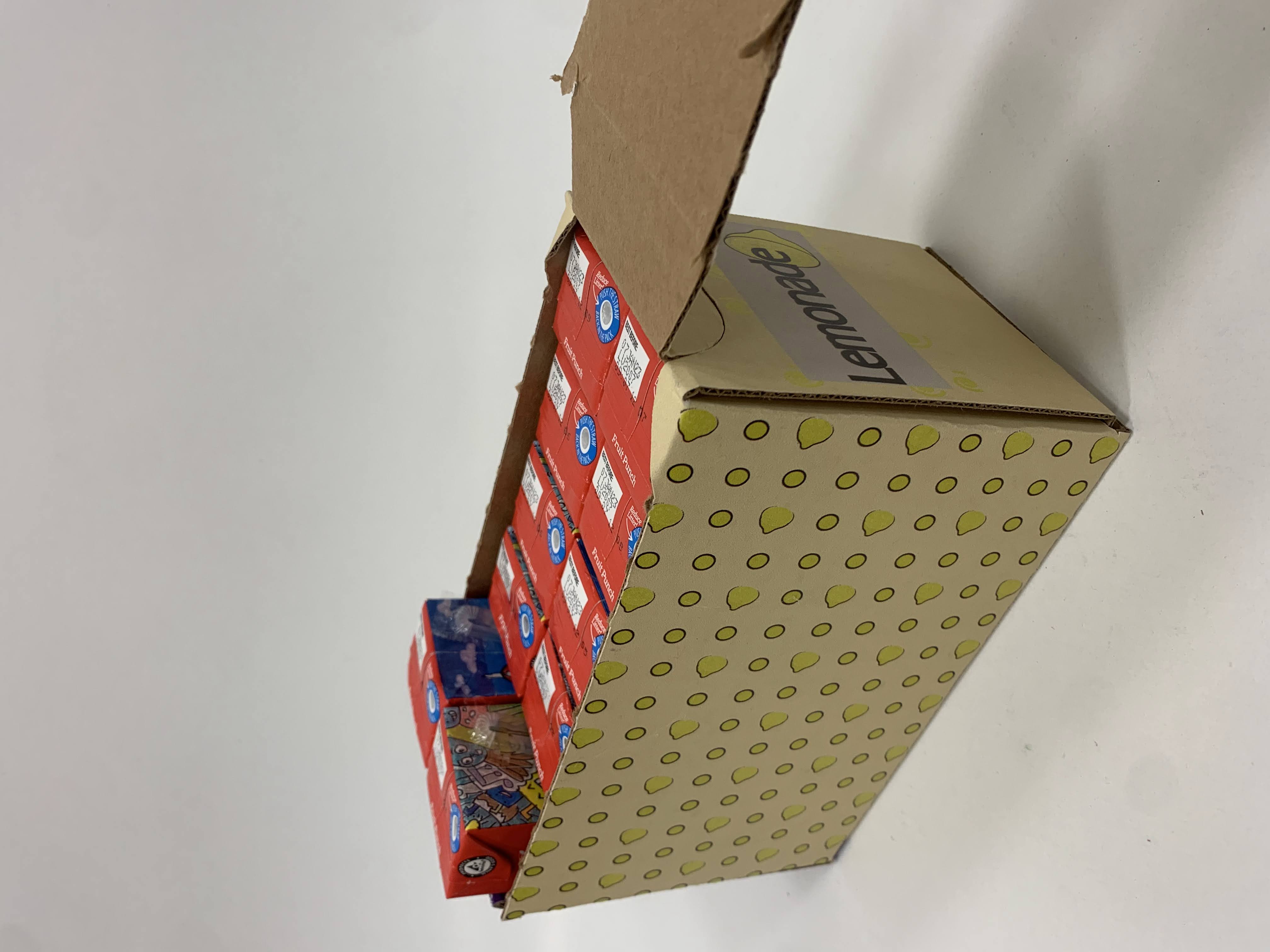
Plastixx has tasked us with the creation of a new, innovative packaging solution for a 40-ct pantry pack of 200mL (6.76oz) juice boxes. The chosen solution is a splitting box with two sleeves, supporting ten juice boxes in each individual sleeve. Two of these twin-pack packages are stacked on top of each other to make a combined 40-ct package. The package is primarily made of recyclable corrugated board, with a recycled polyethylene wrap to secure the package.
Design Challenges:
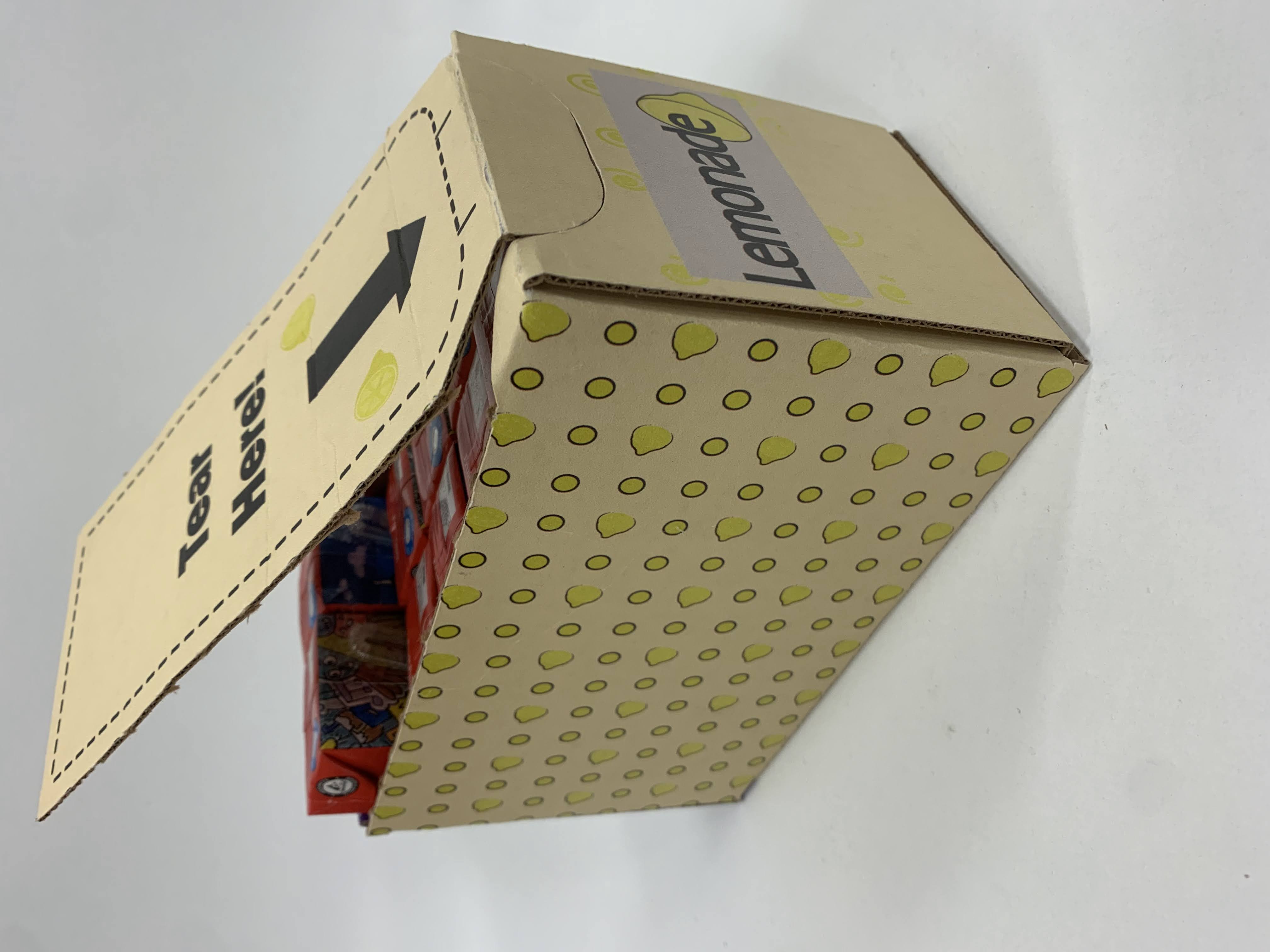
Our goal was to increase accessibility and sustainability without compromising the durability of the overall 40-ct pack. Corrugated board sleeves can be easily recycled or reused by the customer. By using a recycled Polyethylene wrap to hold both twin packs together, less new plastic is being created. The package begins life as two 20-ct juice box containers shrink-wrapped together, that will individually separate into 10-ct juice box sleeves. The two twin-packs are not meant to be separated at the retail level, but by the customer. The consumer can remove the desired juice box 10-ct pack(s) from the rest of the package through a perforated tear in the center of the twinpack. Through this easy to separate method, customers can easily store the juice box containers on pantry shelves, reducing the amount of floor or shelf space traditionally taken up by the product. Each corrugated package has a perforated tear-away top panel to improve the consumer’s access to individual juice boxes. Unlike the traditional polyethylene wrap method, this design can maintain containment and organization once the container has been opened.
Visual Challenges:
A glaring issue with most juice box packaging is that,in many cases, the juice boxes are held together with a small amount of paperboard for advertisement and a large polyethylene wrap to hold the cartons together.
Our solution was to create juice box containers that are easily identifiable through specific color coding and graphics for the intended juice flavor. Each package features graphics and color patterns appropriate for each flavor. This simple approach is meant to make it accessible to any consumer, including colorblind consumers, and we believe that the design choice should be visually appealing to children through fruit graphics, font, and fruit and circle patterning on the sides of each package.
The design of the package is practical for customers and the producer. The twin corrugated container design is easy to sell in varying quantities, with options for a singular twin 10-ct pack, two twin packs, and possibly more quantities for larger bulk orders.


