Prism Fridgepack Redesign
Prism Fridgepack Redesign
| School: | Georgia Institute of Technology |
| Team: | John Hill, Brendan Oshida, Andrew Knops |
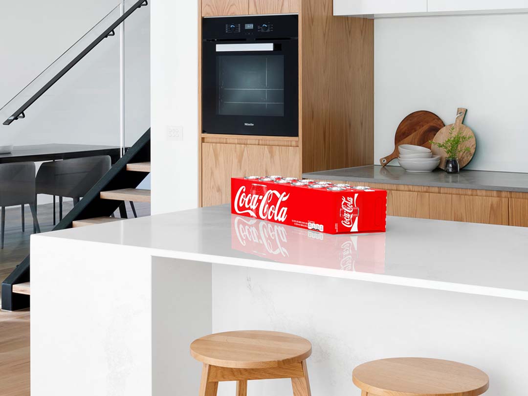
When redesigning Coca-Cola’s 12-can fridge pack, we focused on making more efficient use of material while creating a visually differentiating design that addresses an existing issue with users. To reduce the materials, we first offset the two banks of six cans in a hexagonal pattern to make a more efficient packing layout; this decreases the amount of wasted space. Additionally, we decreased the height of the box so that the tops and bottoms protrude from either end. While this allows us to cut down on material, it also allows for more stable stacking on shelves and during transportation.
Given the new packing layout, the box conforms to the shape, creating two ends that are slanted at a 30 degree angle. Because of its unique shape, the packaging stands out from other brands, with the front of the pack no longer parallel to the shelf front.
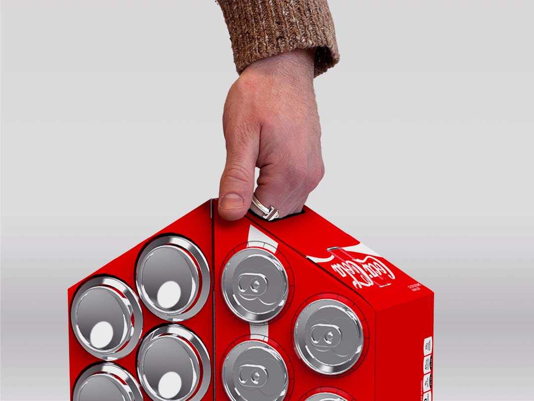
One of the issues with the current design is that it is difficult to hold multiple in one hand. To address this issue, we moved the handle to the top of the protruding edge. This allows for easier removal from shelves and the ability to carry two in one hand, aligning the protruding edges together.
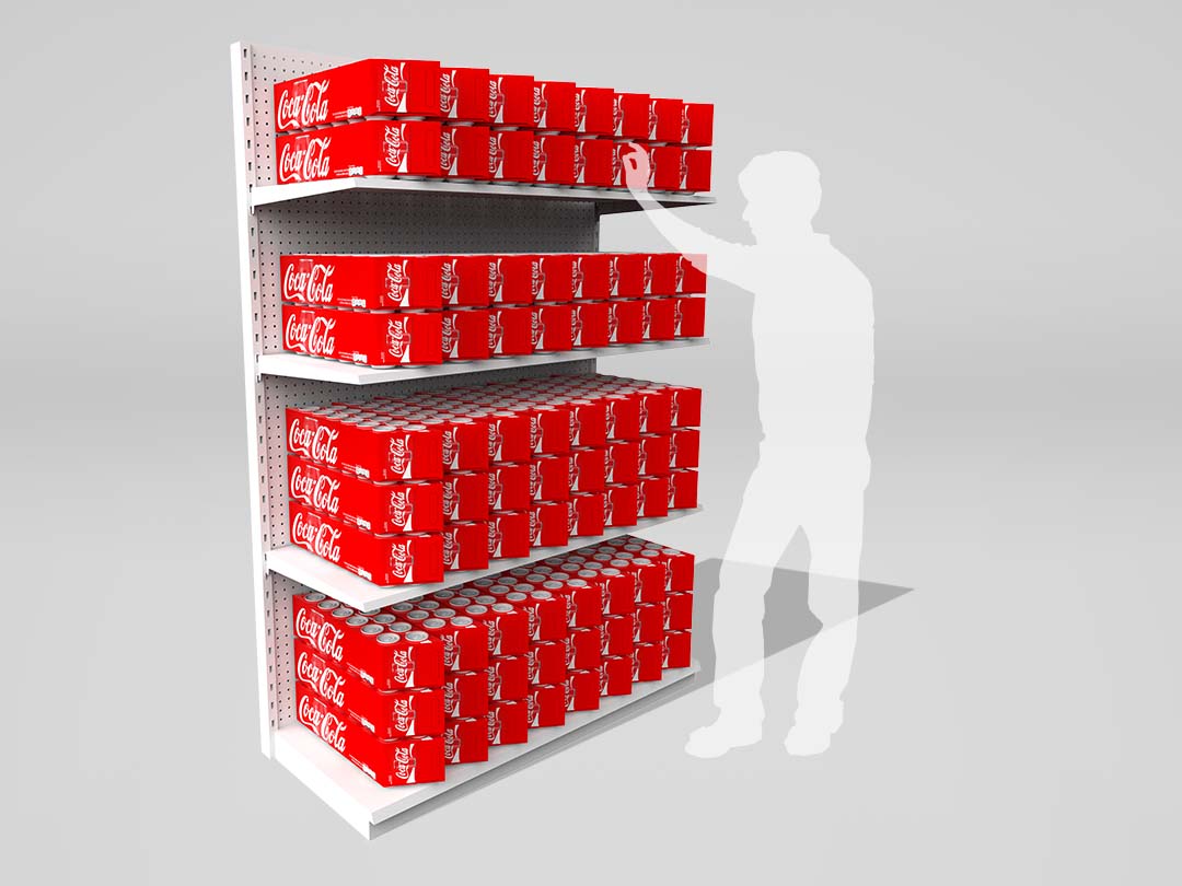
Coca-Cola’s current fridge pack can be used as a point-of-purchase display in stores, using the different flavors and varieties. With our design, the slanted faces allow various effects to be created with the displays, as the angle creates highlights and shadows.
These design changes come at almost no additional material cost. With a doubled carrying capacity, more stable stacking, easy access handles, and greater display potential, our design uses an equivalent amount of material as the current design, with less than 1% more material.