Coca-Cola BuildingBlock Pack
Coca-Cola BuildingBlock Pack
| School: | Clemson University |
| Team: | Clark Derrick, Mary Ashlyn Goforth, Ashley Kirk, Gabriella Roca |
Background
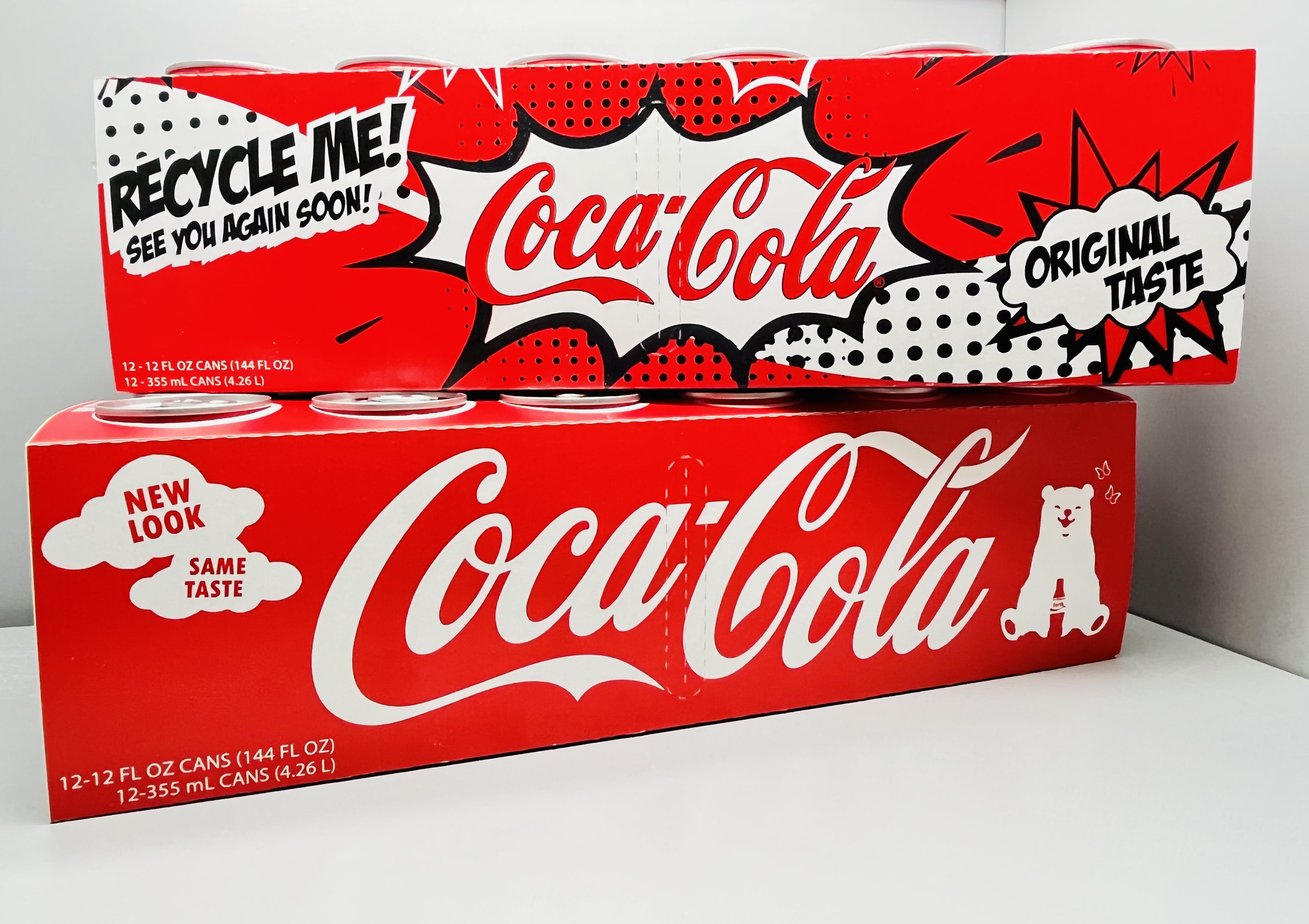
The famous Coca-Cola fridgepack is a traditional, efficient, and highly recognized packaging design structured to hold twelve cans of Coca-Cola. 48 Hours of Stress design group, Clark Derrick, Ashley Kirk, Gabi Roca, and Mary Ashlyn Goforth, chose to redesign this package to minimize the amount of material needed to hold and carry the twelve cans while also being functional.
Materials, Structure, and Manufacturing
Our redesigned aluminum can carrier is made out of recycled paperboard that provides a light-weight solution that maintains affordability, stability, and usability. This material allows for the package to be easily recycled while also using recycled materials to accentuate Coca-Cola’s “see you again” slogan printed on their cartons.
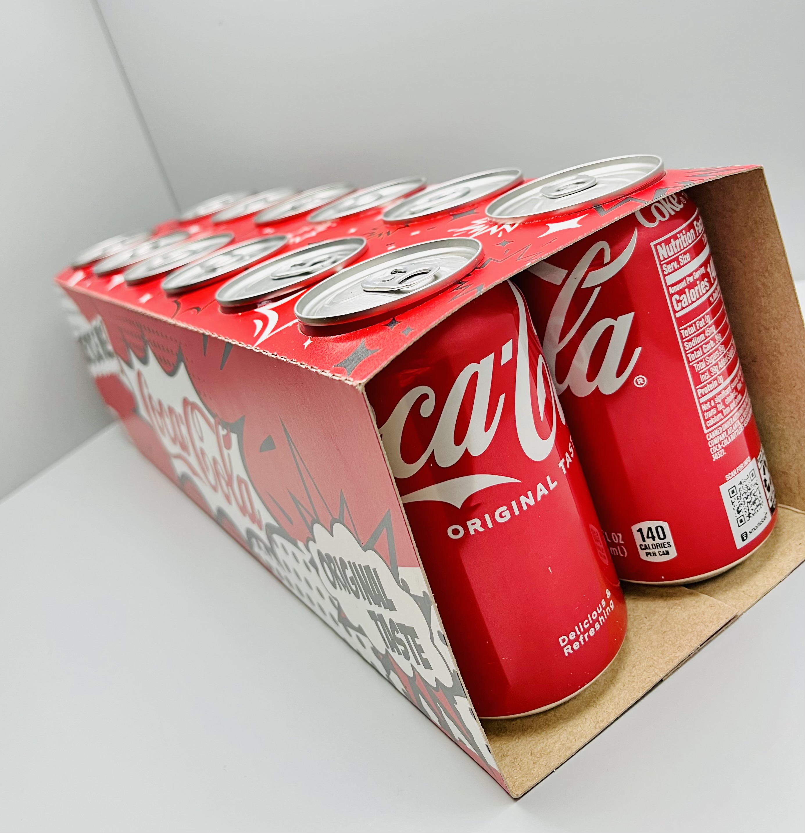
The perforated hand holes on the right and left sides of the package allow the user to easily pick up and carry the package the same way they traditionally have with the existing fridge pack carton. The holes on top of the package securely hold the cans from slipping out of the open sides of the container when holding and carrying. Perforations along the top edges of the package allow for the side and bottom panels to be torn away and disposed of while the cans are still held in place. Once torn away, the cans are easily removed from the top panel at the consumer’s convenience.
The current design goes through a high speed manufacturing process and we wanted to maintain this speed. The redesign allows for the cans to be dropped into the holes where they “snap” into place and are secured. From there the panels are creased to wrap around the cans and are sealed with a small overlap on the bottom. After packing and sealing, each case can be stacked as it is with the flat tops and bottoms in the rectangular prism profile.
Environmental Impact
Coca-Cola’s mission statement highlights the goal to create value and make a difference in the world. Our team set out to help achieve this goal in the redesign. Packaging waste represents around 30% of solid waste in the United States today. Not only does the redesign use sustainable materials in the structure, it also has an approximate 12% reduction in material usage from the standard Coca-Cola twelve can box.
Graphics
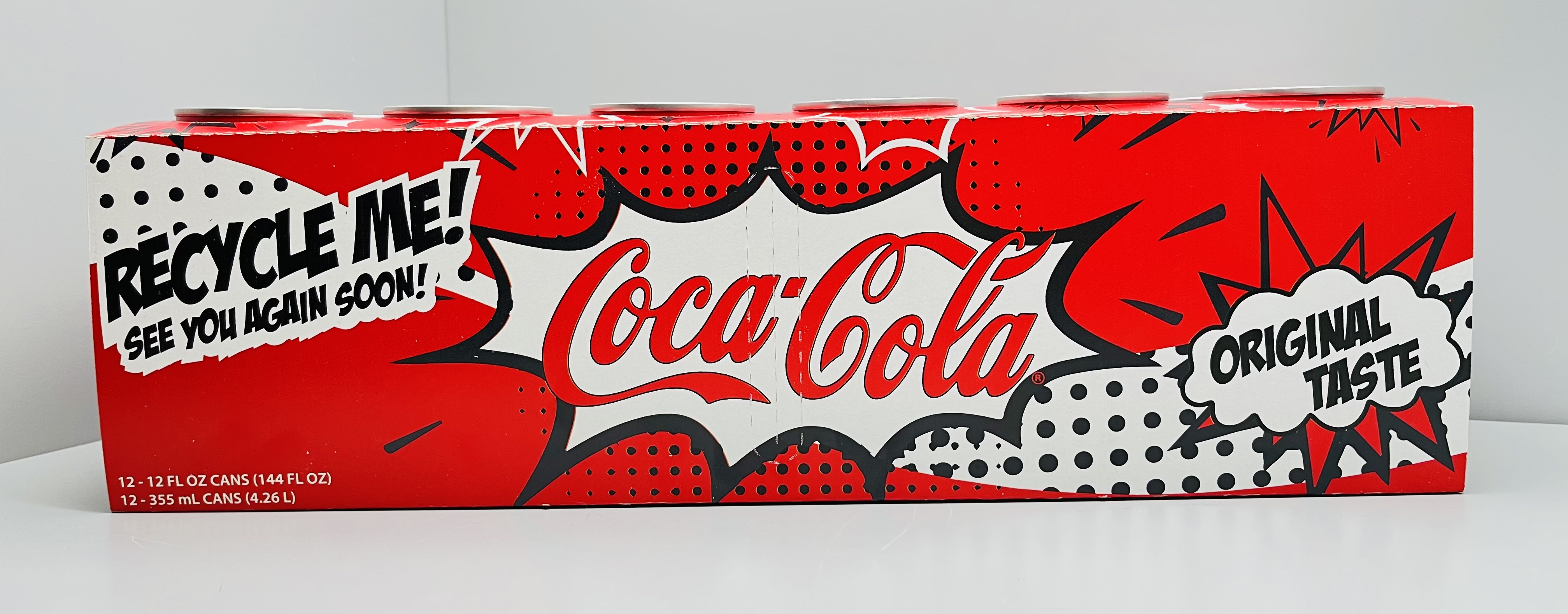
The graphic design process included doing extensive research on Coca-Cola’s current branding, advertising, and marketing styles so that we could gain a better understanding of how to match Coca-Cola’s eminent aesthetic in a refreshing way. The design on this carton includes black, white, and Coke Red. It avoids the use of metallic prints and varnishing to avoid extra manufacturing efforts and inks since this carton has a short lifespan. Because each can has its individual nutritional label and are visible from within the package, the classic Coca-Cola “sip & scan” QR code was included to take the consumer to Coca-Cola’s smartlabel website where they can see nutritional information, explore other Coca-Cola products, and learn more about recycling this package.


