The Prism Package
The Prism Package
| School: | Miami Ad School |
| Team: | Rachel Boyles, Abby Hellman, Caroline Lafontant, Maggie Weldner |
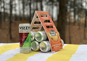
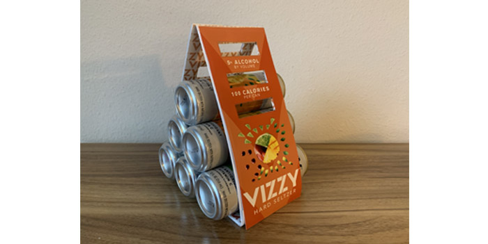
Hi-Cone’s goal was to create a 100% curbside recyclable, compostable, or biodegradable product by 2025. The Prism Package does just that: made from 100% recycled, corrugated paper that biodegrades entirely within just 3 months. The Prism Package holds six 12 fl oz. cans and is even sturdier than traditional cardboard at a lighter weight to reduce shipping costs. It measures at 4 inches by 26 inches. The package is simple, being created using two main folds on one piece, and is held strong by water soluble glue, which attaches the handles at the top and holds the cans in place. The package is also customizable with die cuts integrated into the design that serve as various points to hold. Featuring perforation, customers can tear down to a lower handle point either for personal comfort or to ensure that no matter if it’s the first or the last, the seltzers will always be secured in place and balanced within the box.
The Prism Package is made entirely of recycled paper-based materials. To use less material, the handles are completely cut from the design, unlike that of “pop out” handles, which you will find on traditional soda packaging. These die cuts also help to display the product and lower its weight, reducing the overall environmental footprint. The glue is easily removed allowing for the package to break down as one flat piece to be recycled, so that consumers aren’t discouraged by strong glues or tapes.
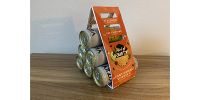
The graphic design process began with choosing which of Hi-Cone’s largest customers to represent in the packaging. Vizzy Hard Seltzer was chosen because of the brand’s unique take on a market that is saturated with ‘sameness’. Vizzy stands out as the first hard seltzer with vitamin c, and is aimed at health conscious consumers that fall in an older target market than their competitors’, falling between 25 and 39 years old. Vizzy was the perfect brand for the triangular shape of the Prism Package, that perfectly embodies Vizzy’s quirky and bold tone. Vizzy’s brand was kept consistent throughout using their colors and font family from preexisting marketing materials. To further connect this package to Vizzy, the Prism Package is being used to introduce a new Variety 6 pack that is entitled “Hint of Variety” to play off their existing copy used to describe their flavors. Up until now, Vizzy has only had 6 packs of one flavor or large packs of a variety of flavors. For a consumer who is more likely to be casually drinking with friends, rather than needing a massive party-sized pack, this is a great addition to their product line. Reflecting the existing can design, the package features graphics of all of the flavors forming one fruit that spreads from the center to other areas of the package, which mimics the dramatic slant that they have between their fruits on the cans. It also shows real images of the fruit to remind their audience of their health focus.