Coors QR Code Six-Pack
Coors QR Code Six-Pack
| School: | California Poly |
| Team: | Michaela Kwan, Sam Savery-Orton, Stephanie Tang, Avery Johnson |
Mixed paper is the most common curbside recycled material, amounting to an estimated 17.1
million tons generated by single family homes, according to the Recycling Partnership. In order
for Coors to promote recycling, The Boxstreet Boyz decided to continue the most popular
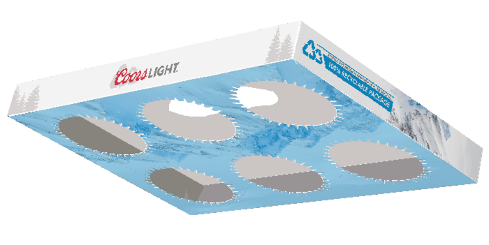
recycling trend and create a paperboard hi-cone alternative by using a 12 point solid
unbleached kraft board (SUK) along with glue to secure this economic and sustainable
package.
The package contains an ergonomic handle that is flush with the top of the package where the
user can comfortably grip the paperboard and carry it with one hand without causing discomfort
or damaging the cans. The rationale behind the location of the handle was to provide a
comfortable grip while also maintaining the structural integrity of the container, which is part of
the reason the grip is off-centered.
The cans are held tightly together with a paperboard cutout that supports the rim of the can
throughout transportation. Once the consumer is ready for a refreshing beverage, the can easily
pops out of the paperboard slot on an angle and is ready for consumption. When using the
paperboard hi-cone alternative, each package can still easily stack on top of one another,
allowing for an accessible shelf display and added branding on the top and side of the
paperboard.
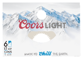
Our graphics are inspired by the classic Coors Light container and can with our own twists. We
began with a slight redesign inspired by their Wilson’s Peak icon logo. We used two recycling
symbols to represent Wilson’ Peak and Molson Coors’ commitment to recyclable packaging and
sustainability. Coors’ brand colors were maintained and used throughout the entirety of the
package redesign to preserve its brand recognition. We also used two typefaces, Futura
(medium) and Ballpark Weiner, to mimic the Coors Light logo and retain consistency throughout
the design.
The phrase, “made to chill the earth,” is a take on the traditional Coors phrase “made to chill.”
This serves as an indicator to the consumer that the product they are about to purchase is more
eco-friendly than ever. It is also an implication for the contributions that using less materials in
packaging makes to fighting global warming. The addition of tree graphics on the package serve
to show how Coors is taking a more direct approach to recycling and is also a reminder of
Coors’s commitment to protecting nature. This is achieved through the use of paper-based
materials, which is a sustainable material, rather than plastic and contributes to a closed-loop
lifecycle.
The QR code located on the side of the newly redesigned Coors Light box provides an
opportunity for the customer to interact with the packaging, leading to the Molson Coors
Beverage Company’s 2025 Imprint Goals, showing what Molson Coors has done to brew
sustainably, build a strong community, and support responsible alcohol consumption. Overall,
this package is homogenous with Coors Light’s current branding while also aligning with Molson
Coors’ goals for sustainability.