Coors Pyramid Pack
Coors Pyramid Pack
| School: | Clemson |
| Team: | Eliza Basel, Sophie Taylor, Weston Whitfield |
Plastic Hi-Cone rings, while the standard in can packaging, have received
backlash over pollution and sustainability concerns. Even if the rings are degradable,
they can leave behind harmful microplastics, and the low-density polyethylene used to
produce them has limited curbside recyclability in the United States. Molson Coors is on
a mission to “put a stake in the ground and raise the bar.” Among their sustainability
targets, they aim to make a positive impact on public health, the environment, and
communities. Furthermore, they strive to package their products in 100% recyclable,
reusable, or compostable materials, according to their 2025 Imprint Goals.
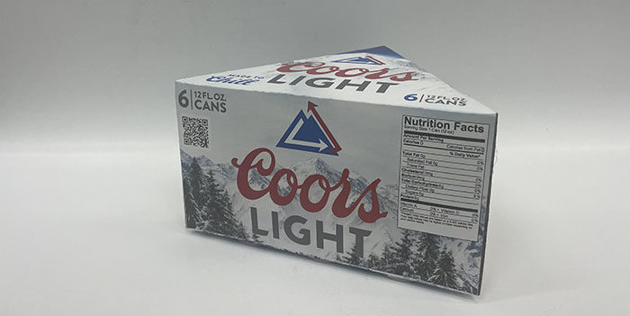
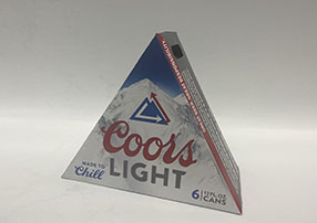
Paperboard is widely recyclable and has a lower carbon footprint than traditional
Hi-Cone rings. Made of clay coated board, the package has a smooth surface for higher
quality printing and graphics. This material meets the FCC Green Guide standard for
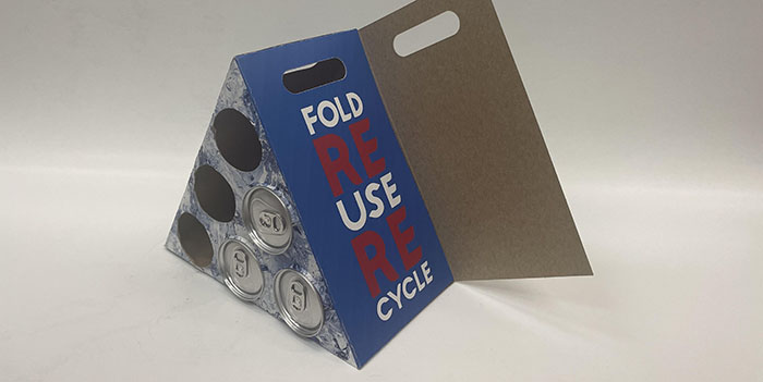
recyclability in the continental United States. Aside from being fully recyclable, the
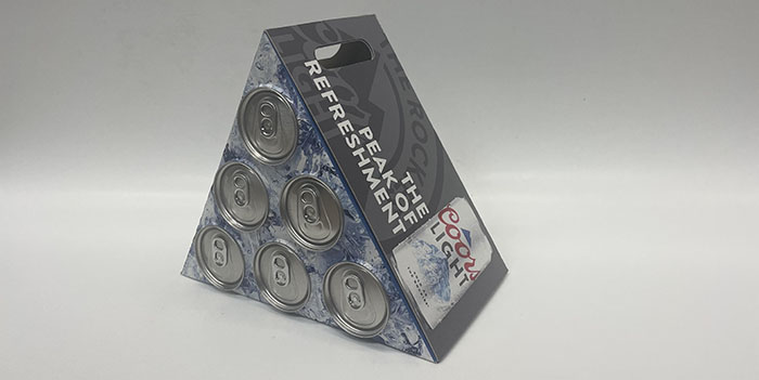
package is reclosable and reusable. Unlike conventional paperboard beverage
packages, it features a unique fold and carry design that allows users to transport and
stow unopened cans or even pop in their own. It can also be used to hold empty cans
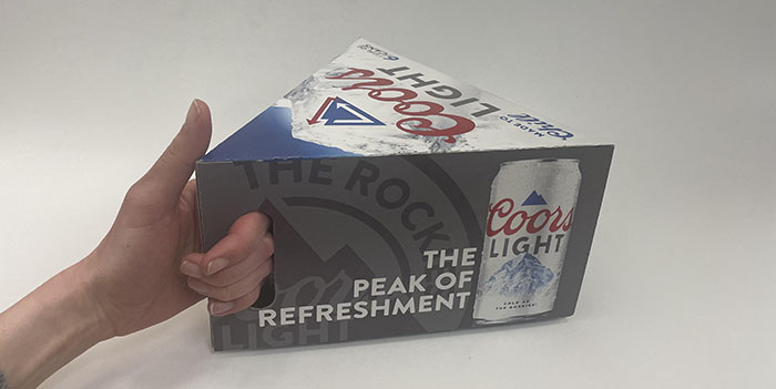
until they can be responsibly disposed of. An ergonomic cut-out handle makes Coors
easier to carry than typical Hi-Cone plastic rings. The toothed openings are designed to
secure the cans inside the package, reduce material, and give consumers a view of the
cans inside.
With a new pyramid design, these carriers are eye-catching on the shelf while
still being efficient to palletize. The unique shape alludes to Coors’ association to Wilson
Peak, but could easily be adapted to other six-pack lines. A clever homage to the
recycling symbol wraps around the Coors Light mountain, representing Molson Coors’
dedication to sustainability, from the peaks of the Rockies and beyond. The bold red
and chrome graphics align with existing Coors Light branding. Icy imagery on the panel
of exposed cans gives the sense of reaching into a cooler for a chilled beer.
In this repack, we express Molson Coors’ mission of being responsibly
refreshing.