SR Jayhawks
SR Jayhawks
| School: | University of Kansas |
| Team: | Alison Benz, Zach Butenas |
DESIGN RATIONALE:
Our team chose to seek opportunities in juice box design through exploring ways straw replacements
could be integrated into forms.
PROCESS:
We began this process by creating a mind map of ideas surrounding packaging, juice, straws, children,
and more. This creative way of thinking helped inspire initial sketch ideas. The thumbnail sketches we
did explore every concept that came to mind, and after evaluating them we were able to do more ideation
on the concepts that we favored.
In a time crunch, we narrowed down our sketches into quick prototypes and decided on two directions
to continue moving forward with. The prototypes exploring more variations of our final two forms
helped us narrow the concept down to our final- the Switch Cup.
REASONING:
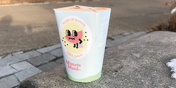
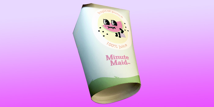
The Switch Cup design is one that is durable, yet flexible, and can transform from a stackable container
into a common drinking vessel for children. The “Sippy-cup” spout acts as a straw- preventing large
spillage and ease, while also creating a recognizable feature for kids.
The manufacturing of the design is all from one piece of material, eliminating wasted scraps. The process
for constructing the body is similar to that of paper cups; the body is formed and folded, then the
bottom is stamped to create a sturdy base.
The overall form of the design holds tension in the lid. When the container is sealed, it is airtight- preventing
juice from spilling out or germs from getting in. As soon as the seal is broken, the spout can be
popped into place. The rounded bottom of the design curves the spout to stay open, and easily able
to pour the liquid. While the rectangular lid allows a straight fold and creates a flat top, the rounded
bottom creates the “switch” in the design: the spout opening to act as its own straw.
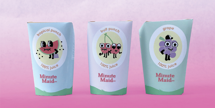
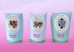
GRAPHIC ELEMENTS:
The visuals are simple to relate to the design style of the children drinking the juice. By remaining minimalistic,
there is more emphasis on the indicators pointing to the seal. Because this design is unfamiliar
to users, the graphic design elements on the outside of the juice box educate the user on how to open
the spout.