Honest Juice
Honest Juice
| School: | University of Florida |
| Team: | Tyler Goertzen, Savannah Gross, Spencer Serrano |

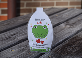
This design was inspired by the original Honest juice pouch structure and maintains key elements that make the brand stand out on shelves. The current pouch shows an irregularly shaped body which the team wanted to maintain. The proposed pouch was made to be a more rounded shape because it complements the mouthwatering nature of fruits. Like the current packaging, this interesting shape catches the eye and is a stable structure that can stand upright.
The layer structure of the pouch will consist of an outer polyethylene layer, a middle aluminum layer, and an inner polyethylene layer. To include a straw-less drinking feature, a tab is created at the top. Along this top, there is a perforation, so that when the tab is pulled the rounded mouthpiece will be formed. The aluminum layer will ensure that the rigidity of the mouthpiece will be maintained. With this mouthpiece, consumers will still be able to experience the functionality of a straw without the hassle of unwrapping, inserting, and adjusting the straw. Nor will they ever have to worry about accidentally puncturing both sides of the pouch and losing juice.
The graphics chosen were animals because kids love animals when they are growing up. Additionally, it personifies the product by making it more relatable, playful, and friendly. It was decided that the animal found on the pouch would also combine with the flavor of that specific juice pouch. Having the animals on these pouches is used as a reminder for kids that no straws will allow animals to live longer, fuller lives.
