Anything is Box-ible
Coca-Cola PaperPop
| School: | California Polytechnic |
| Team: | Dominique Lau, Ashley Chen, John Dizon, Blaine Boyd |
STRUCTURE
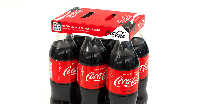
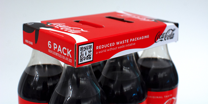
The PaperPop is a KeelClipTM-style package that contains six 16.9 fl oz. Coca-Cola bottles. The PaperPop is made out of clay-coated newsback sourced from 100% recycled paper-based materials, such as old corrugated container and newspaper. The blank size of the PaperPop is 15.913 inches by 5.912 inches and uses 93% of the blank size area, minimizing the amount of material used to bundle the six bottles together. However, strength is not compromised; the strength of the package stems from sealing the three panels together with glue, assembled during manufacturing with folding arms.
FEATURES
The insert holes grip the flange of the bottle and feature a frayed cut to allow for easy bottle removal. These insert holes also make it easy for the bottles to be bundled together in manufacturing. The built-in handle is designed for easy pickup and transportation. This flat handle also allows for six-packs to easily stack on shelves.
ENVIRONMENTAL IMPACT
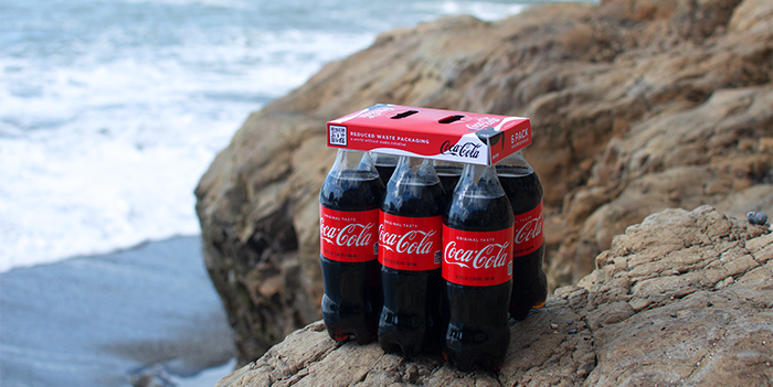
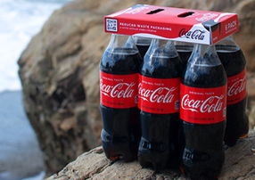
Because the PaperPop is made of paper-based materials, it is easily recyclable and biodegradable, unlike plastic rings used for six-packs. Clay-coated newsback uses significantly less paper than corrugated fiberboard, minimizing the use of natural resources for manufacturing and is more environmentally friendly. The built-in handle additionally conserves material that is normally used to create a pop-out handle. The PaperPop as an alternative to plastic rings gives more surface area for branding. This is important especially in an effort to advocate for recycling under Coca-Cola’s world without waste initiative.
GRAPHICS
The graphic design process consisted of conducting extensive research on Coca-Cola’s current branding, advertising, and marketing styles. In doing so, a better understanding was gained of how graphics could realistically match Coca-Cola’s current products on the shelf. Hi-con packaging yields detrimental effects on sea life, specifically sea turtles that get wrapped into the plastic cutouts. Therefore, implementing turtles in the design elicits an emotional connection with consumers who realize that using this paperboard alternative to plastic hi-cons will result in less plastic in the oceans, and thus, protecting sea turtles. The Coca-Cola branding was kept consistent with its brand colors of Coke Red, black, and white. Using their branded silver was avoided to prevent difficulties when direct printing for packaging; it is unnecessary to go towards extensive manufacturing efforts due to the short life span of the paperboard. In addition, the Gotham font family branding was adhered to reflect Coca-Cola’s easily recognized visual identity. Since each bottle wears its individual nutritional label, the classic Coca-Cola’s “sip & scan” QR code was replaced with a new QR code that educates the consumer on the Coca-Cola company’s world without waste sustainability efforts, such as highlighting nearby recycling facilities. Overall, this design fits seamlessly into Coca-Cola’s current product line while emphasizing its place in Coca-Cola’s world without waste initiative.