SloPack
SloPack
| School: | California Polytechnic |
| Team: | Alex Gambill, Alyssa O'Halloran, Steven Nguyen, Eric Swearingen, Nirav Chhajed |

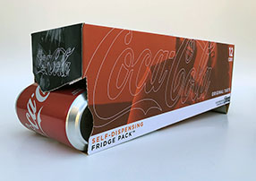
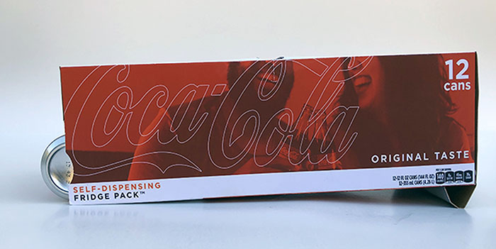
We decided to take on the challenge of redesigning Coca Cola’s 12 can Fridge Pack to improve the opening and the dispensing of the package. We used a new case of Coca Cola to find areas in the original design that had opportunities for improvement. When buying and opening up the current design, we saw an opportunity for improving the dispensing convenience of the Fridge Pack. We noticed that after the first six cans have been dispensed from the current Fridge Pack, the consumer is required to reach to the back of the box to retrieve their Coke. With our new design, we created the ability for the back end of the 12 pack to be elevated to allow every can to roll down towards the opening.
By placing our opening on the bottom of the package, we minimized how far consumers have to reach into the package to retrieve the next can.The opening restricts the cans so they stay within the Fridge Pack until the next can is ready to be enjoyed!
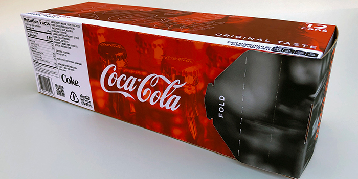
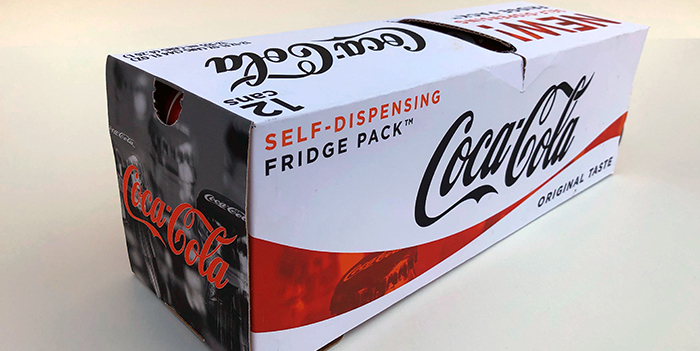
Coca Cola being such an iconic brand, keeping that strong presence with a fresh twist will attract and delight consumers. Using existing styles, logos, the signature spot Coke red and adding nuances like outlined text and colorized photos indicates to the viewer artful innovation and visual interest. Customized photos (of public domain) of people enjoying Coke as well as historical reminders, spark nostalgia and carry on Coca Cola’s core values of generating joy and happiness through their acclaimed soft drinks. The design was created with a realistic approach using many existing technical copy such as nutritional facts and “original taste.” User interaction is indicated at the contrasting black and white portions of the design along with explicit instructions. Modeling after the existing package layout, the same brand message is portrayed through each panel in a different way to create a strong primary display panel at any angle.


