Mondelez Variety Pack
Mondelez Variety Pack
| School: | Virginia Tech |
| Team: | Emilee Wooten, Katelyn Farkas, Gillian Cubbage |
Our challenge: design a variety pack for Mondelez International containing (1) Family Size Oreo, (1) Family Size Chips Ahoy!, and (1) Family Size Ritz that meets Amazon’s SIOC (Ships in Own Container) requirements. These three products are often purchased in the same transaction. The most efficient design for e-commerce is a variety pack containing all three. However, varying primary package size makes distribution packaging difficult. Mondelez seeks to delight their customers, and to do that we must design so that the products are not damaged during distribution.
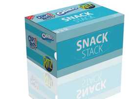
Mondelez International’s mission is to offer the right snack at the right moment made the right way. In order to fulfill that mission in a creative way, we decided to incorporate drawers into our design. While we could have made the trays making up the drawers into individual cartons, we felt that the inclusion of drawers would make for a more enjoyable consumer experience. The drawers provide additional functionality: they can be used as a built-in serving container and display for use at family gatherings. Quick and easy access to all three products also provides convenience for grabbing a quick snack or even for packing a lunch. The Oreos and the Chips Ahoy are very well suited for putting in a drawer, due to the placement of the re-sealable openings. One remaining obstacle is that the Ritz primary package is entirely different than the other two and is not as suited to placement in a drawer. To remedy this, we suggest making the top face removable via perforation. It gives the same effect as the adhesive seal on the other two packages, but retains the essential structure of the original Ritz package. In order to access the drawers even more easily, the panel in front of the drawers has a thumbhole and the edge of the panel is perforated so it can be removed. To make the drawers easier to open, we added handholds.
For the graphics, we decided on a relatively minimalistic design (no product pictures) featuring the three product logos plus a new logo for this specific product on a two-toned blue background. The use of blue in packaging conveys effectiveness and reliability. Lighter blues specifically provide more appeal to the market for families and children, and can indicate that the product is calm and safe.
We used E-flute for the outer box, but further testing may reveal that larger flutes would be better choices in order to meet the requirements for SIOC. The use of recycled material in full-scale production is highly encouraged.
Once the initial products are depleted, consumers can get a secondary use out of the package by either restocking the drawers with more of the same products, or by removing the inserts and repurposing them for storing personal items.
In order to further optimize the variety pack we recommend increasing the Oreos and Chips Ahoy to party size, because the dimensions are closer to those of the family size Ritz, making the inserts unnecessary.