Diet Coke Redesign
Diet Coke Redesign
| School: | Portfolio Center |
| Team: | Courtney Jacobs, Peyton Foley, Dan Currie |

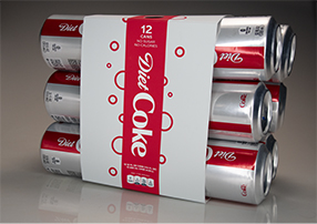
Our team re-designed the existing 12 can and 8 can fridge packs for Coca Cola’s Diet Coke. We approached the design process by questioning how we could create a seamless user experience, while reducing the amount of materials used.
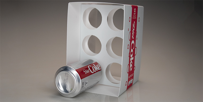
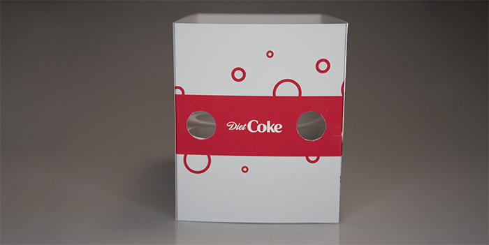
Our solution to the problem is to use perforated rings to hold the individual cans inside of a belly band that wraps around the package as a whole. The perforations on the interior allow the cans to slide into place and lock in. Leaving the sides of the packaging open allows for users to grab cans from either side with no opening necessary. The new shape of the packaging is more compact, due to its shorter width, than the original so that it is better suited to fit into refrigerators. Circular cutouts at the top of the package allow consumers to grab the package easily and comfortably.
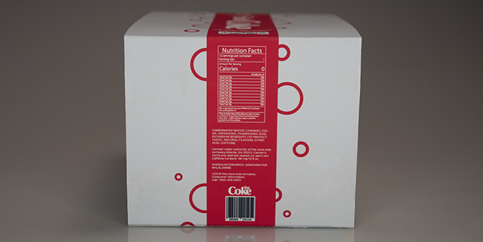
Our packaging reduces the amount of materials used in the original fridge pack by 35%. The die-line is cut from one 100% recyclable plant-based board, so production is a breeze. The design of the exterior stays true to Coca Cola’s brand standards and mimics the design of the Diet Coke cans. We introduced mono-line bubbles to evoke a modern, bright, and bubbly feeling that Coca-Cola embodies, while still maintaining a simple and clean look.


