Coca-Cola Fridge 12 Pack
Coca-Cola Fridge 12 Pack
| School: | RIT |
| Team: | Kelsey Charleson |

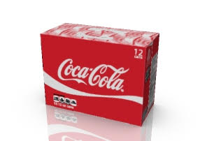
When the current fridge pack was created it was a whole new level of convenience for consumers. No longer would you have to unload all your cans one by one into your fridge to keep cold beverages on hand. Simply tear the open feature and the carton becomes a dispenser easily placed in your fridge. While this design is still highly convenient, what is one thing many people struggle with in this scenario? Fridge space. So frequently we come home from shopping and have to squeeze, rearrange, and possibly throw out some old items to even make room to fit a new item. The current fridge pack isn’t so convenient if we can’t even fit it into our fridge in the first place.
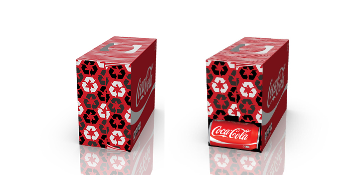
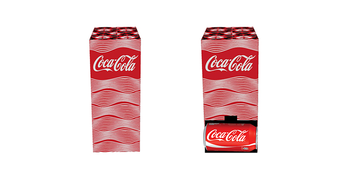
This new design re-configurated the cans within the carton, creating a new shape which allows it to rest on more than one side comfortably. The carton features two opening features, allowing you to choose which side to rest the carton on depending on the available space in your fridge, and still have convenient dispensing of the product. Regardless of which side you choose to rest the carton on, the surface area needed in your fridge to set the fridge pack is less than the current design. The new handle design also provides a more comfortable and sturdy hold, making the carton less likely to tear when carrying.
This new design requires a slightly smaller blank size than the current design, allowing the use of less material. Continuing to use a clay coated Kraft back material allows both the use of recycled material, as well as providing a good print surface. Coca-Cola has a very strong brand identity; this good print surface is important to maintain the high-quality branding that Coca-Cola carries throughout all it’s product lines. The design elements of the carton help encourage the consumer to recycle by incorporating how2recycle information as well as graphical elements pushing the importance of recycling.


