Bring Coke Home
Bring Coke Home
| School: | Rutgers University |
| Team: | Changxu Pei, Zhiqi Peng |

Coca-Cola 12-can paperboard fridge pack has been used for a long time. It is considered as one of the most iconic packaging designs in the industry. The packaging is an environment friendly product which is made of 100% recyclable paperboard. The cross-section area of the product can be fitted into any shelves in any fridges. However, this is not a perfect design. The paper handle on the top panel of carton could potentially fall apart as customer carries it and walks around in the supermarket. The length of 12-can fridge pack is too deep for customer to reach the cokes on the other end of carton. To properly address these problems, our team get inspiration by the 6-pack glass bottle coke packaging design and propose a new packaging design that keeps the advantage of current packaging design on product transportation and correct its disadvantages on carrying and user experience.
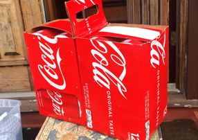
Through the cube efficiency of current 12-can paperboard pack, the packaging maximizes the usable storage space. It is a great solution for transportation from manufacturer to supermarket. But this design has potential risk of falling apart during carrying by customer. To solve this problem, we suggest removing the original paper handle design on carton, creating individual dotted line on front, back, and top panel of the packaging, and constructing a new handle on the inner surface of the packaging. This new design allows staff use the same way to pack this carton as the old design during transportation, it maintains the advantage on maximizing storage space. As the customer takes the product from the shelf in supermarket, he only needs to push through the advance dotted line on front, back, and top panel of carton. The packaging will automatically fold in half along the bottom line and the hidden handle in the packaging will be presented. This design offers a better shopping experience and a secured solution for the customer.
When it comes to user experience, current packaging design has issue with the convenience for easily taking out the coke from the packaging. The length of packaging allows consumer to carry more cokes at the same time, but it is hard to reach the coke on the other end of packaging. Our team has considered this problem. In our design, the packaging will be horizontally slid into the shelf. The surface attached the handle will face the customer and the customer can effortlessly grabs the coke even on the other end of carton after removing the paper strip. The paper strip is used to prevent the coke from moving around during the trip from supermarket to home. Moreover, this design allows more people to take the coke from packaging at the same time. No one has to wait.
Our design has more appealing structural design than current one. It is much fun to transform the packaging from one to another for customer. This could potentially boost the sale of Coca-Cola products.
