SwiftAid
SwiftAid
| School: | Portfolio Center |
| Team: | Natalia Ruiz, Steven Graziano, David Payne, Valerie Morse |
The SwiftAid is our new, innovative, and environmentally friendly bandage package, that allows
for a speedy process when covering a wound. The consumer will enjoy a safe, easy, and swift
transition from the time they remove the bandage to the application over the wounded area.
Our wheel technology provides consumers with the simplest “grab and go” way of applying a
bandage. The main reason is because you can use it with one hand. The wheel system makes it
easy to open the lid, peel off the bandage, apply it, and not have to worry about all that extra
trash that typically comes with dealing with other bandages. Gears inside of the box will keep
the bandages rolling in motion as you peal off a bandage for use, as seen in our video. And the
best part is, once you purchase SwiftAid, all you need to do is to refill the wheels of bandages,
and not have to buy another box. This will save time and money.
With our design we targeted women, specifically moms ages 30-45, and younger children. The
ones who get cut and scraped the most are little children, and of course their mothers who are
helping them apply the bandage. As we know, mothers need both hands to deal with screaming
children and we feel it is necessary to have a bandage product that is easy, fast, and able to use
with one hand.
The name SwiftAid was derived from exactly what it means. Simply put, our bandages provide
aid swiftly. We also strategically chose the word “swift” because it begins with an S. We feel that
the shape of an S matches our wheel shaped product and fits our brand. And when you have a
nasty cut, there is nothing more important than applying a bandage as swiftly as possible.
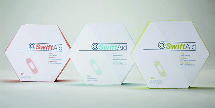
Our logo has two components. First, we have the typography lockup using the typeface
Helvetica Neue, Bold italic, and thin. The word “swift” is bold because the most important aspect
of our product is that it is so easy so use, the process of applying a bandage will be extremely
fast. It is also italic because we wanted to show movement and “on-the-go.” The second
component to our logo is the wheel. The wheel is a symbol of how our product is shaped and
how it is used. It is simply, an unraveling wheel of bandages.
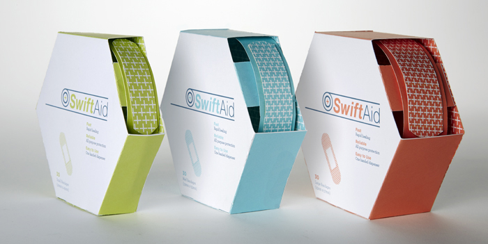
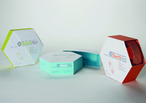
The home for our wheel of bandages is our hexagonal box. We chose this shape because it is
sturdy, so you do not have to use two hands. Also, because this shape can be stacked easier in
stores then if we had used a circular package.
Our color palette consists of softer shades of red, light green, dark green, and blue. The color
palette had to be conscience of the environmental aspect of our package, and also to our
demographic of mothers and children. It is also color coded to distinguish between the different
sizes of bandages.