Big Bertha’s Butter
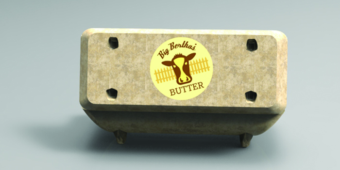
Big Bertha's Butter
| School: | SCAD - Savannah |
| Team: | Andres Santanilla Jaramillo, Federico Villa, Santiago Hossni, Nicholas Huggins, Catalina Guimaraes, Jay Keeree, Luis J. Viyella |
Designing packaging for butter is a task that consists in looking at a long tradition of underdeveloped product design. Realizing that no matter the reason for the packaging to have remained the same for decades, we had to reinvent the packaging in order to fit the needs of the contemporary user. The main issues with current packaging are excessive wrapping/packing, amount of trash created, and usability. Current wax paper packaging around butter sticks forces the user to come in direct contact with the butter, as he is coming into contact with other surfaces and appliances around the kitchen. The messiness can be avoided, and that is where we began to explore new designs, that could not only benefit the user’s physical interaction with the product, but create packaging that creates a lower footprint than its predecessor.
The initial goal was to divide the amount of butter sticks into smaller portions, as it is not always true that the user utilizes large portions, and wants to open that amount of butter, that will dry prematurely. Developing this idea further, we realized it is not the amount of butter that is opened at once, but the fact that the butter cannot be resealed that will make it drier. We kept the portions of 4 oz. butter sticks, but reduced the amount that come in one package to 2 sticks, providing a cheaper product for the majority of people that don’t use large amounts of butter. This also benefits the user that consumes more, as he can preserve butter longer in closed packaging.
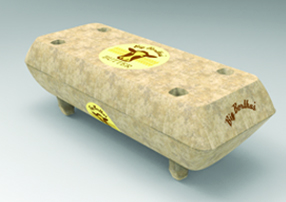
Inspired by barn life, and more specifically the shape of troughs where cows drink water from in farms, the packaging solution resembles an egg crate, in keeping with the tradition of farm product packaging derived from organic materials. This resulted in the use of recycled, pressed pulp as the one material in the butter’s packaging. On the outside, aesthetics play an important part on the shape, yet the supports on the bottom make sure you can stack several products together without them being packed too tight. This enables cold to surround the entire product as it is shipped, also resulting in a more appealing presentation in the supermarket isles.
The inside provides structural support, with 2 corrugated folds that also hold the butter sticks in them. This facilitates grip while cutting, preventing messiness and user contact with the butter.
Although many other designs were considered, featuring divided containers whose tops could be peeled off, or squeezable bags resembling frosting squeezers. Considering structural rigidity, simplicity, esthetics, efficiency in materials use, and shipping, we considered our design to be a very well thought out solution providing a pleasing, fun, yet functional case that can be reused instead of thrown out. The carbon footprint is reduced drastically compared to the old product, and the result is a package that is usable, beautiful, and ecologically responsible.