Organic Valley
Organic Valley
| School: | The Portfolio Center |
| Team: | Lisa Ellerin, Alicia Prentice, Amy Ross, Olivia Duval, Chris Yoon |
Perusing the milk aisle at the local market is rarely a memorable event. Existing milk jugs and cartons want for innovative, intelligent and interesting design. The current trend of “going organic” creates an exciting market ripe for beautiful and environmentally responsible packaging for otherwise basic commodities such as milk. Organic Valley, whose mission it is to operate under ecological integrity and environmental sustainability, is a perfect canvas for this competition: a well-established brand in need of a face-lift. Organic Valley operates under the premise that thinking differently makes a difference. Everything from the food the cows eat to the distribution of the products is carefully thought through in order to ensure that the little differences make a big impact. Just as Organic Valley operates differently from its competitors, so should its packaging.
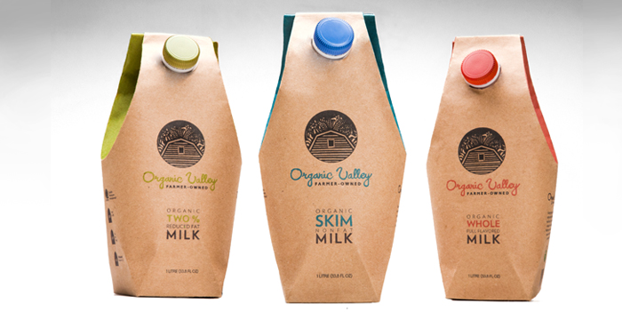
Achieving an environmentally responsible package starts with materials. Tetra Pak is made entirely from recycled and/or renewable resources that are also 100% recyclable. We applied an uncoated, untreated paper to the outside of the container, adding a distinguished, earthy aesthetic that not only captures the attention of the environmentally conscious consumer but stands out on the shelf amid other cartons as well. The aseptic component of the Tetra Pak allows the Organic Valley shelf-stable line of organic milk to be distributed and stored without the use of refrigeration. The extended shelf life of up to a year at room temperature means less waste at retail locations. These components add up to a smaller carbon footprint and leave plenty of room for a unique custom design.
Our Organic Valley Milk container references the classic glass milk bottle form yet remains contemporary in form. The small size and indented neck are ergonomically designed for easy grip, as is the spout, which easily opens and reseals with a twist cap. The color system identifies different types of milk (2%, whole, and skim) by using recognized industry colors, red, blue and green, printed in soy-based ink. Large swatches of color are prominently seen from the sides and front of the container, as well as the cap and text elements. An updated, hand-drawn logo brings a simple, organic feel to the brand, while still referencing the original logo with its cropped barn and sheaves of wheat. The copy on the packaging serves to connect the company’s goal with the consumer to promote recycling and sustainability. Our containers offer a break from the monotony of the milk aisle through color systems, form and material. They maintain environmentally integrity and appeal to consumers through their smart and sophisticated design.