Quaker Oatmeal
Quaker Oatmeal
| School: | The Portfolio Center |
| Team: | Grove, Courtney Burton, Graeme Nelson, Jessica Gamble, Diana Seeger |
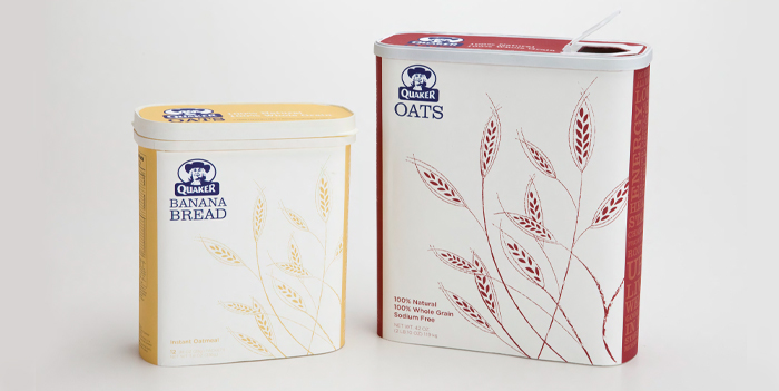
With our re-design of the historical and iconic packaging for Quaker Oats, we have con¬nected the consumer to oatmeal in a fresh, modern, and environmentally conscious way. In addition to improving the usability and practicality of Quaker Oatmeal, we have expounded upon their already recyclable packaging by giving the design global sustainability. Keeping with the classic cylindrical look, we modernized and streamlined the structure by taking the basic box and rounding out the edges.
By converting the cylinder to a box shape the package stacks easily on a pantry shelf or fits conveniently in your desk drawer at the office.
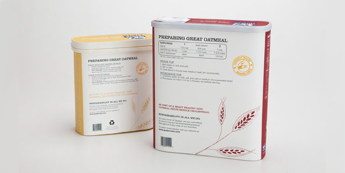
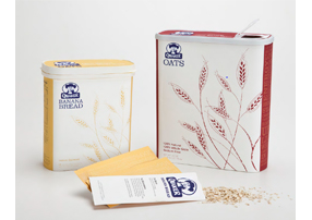
Most importantly, the distribution of this package will allow for Quaker Oatmeal to be delivered to the consumer more efficiently than ever before, reducing Quaker’s carbon footprint upon the planet. Not only will the consumer be healthier for eating Quaker Oatmeal, but they can also feel good knowing that they are supporting a company that is dedicated to preserving the health of our planet. The packaging includes information that makes the consumer aware of such efforts and even directs them to the Quaker website to find out all of the ways that Quaker is committed to community wellness. Improvements upon the design also include a more convenient top that allows for easy pouring and a package for the instant oatmeal packets that is travel friendly and practical.
In addition to improving the function of the Quaker Oatmeal packaging we also refocused the product to promote the current Quaker campaign for healthy active lifestyles and the idea that oat¬meal fuels us. We were able to convey these ideals to the consumer my simplifying and un-cluttering the design. The beauty and simplification allows for Quaker Oatmeal to speak to the buyer as well as stand out on a grocery store shelf.