SQRL
SQRL
| School: | Pratt Institute |
| Team: | Stephanie Hsu, Ian Montgomery, Hyeryun Nam |
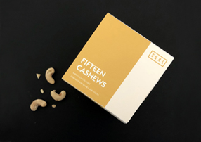
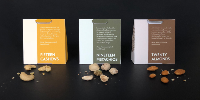
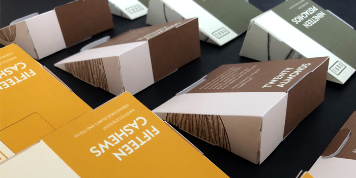
Today we think of nuts as an unhealthy indulgence, a salted, flavored snack to be enjoyed on special occasions. We have completely forgotten the profound health benefits of a modest daily intake of nuts. Our design solution uses a modular structural system and bold graphics to encourage a healthy habit of nut consumption. A box consists of six pods that lock together in an elegant accordion format. Each pod contains the exact daily-recommended intake of nuts, nineteen pistachios, fifteen cashews, or twenty almonds. The small convenient size of these pods allows them to be taken on the go, in a purse, pocket, or backpack. A small perforation near the top of each pod tears open and reveals an easy pour system.
Each package was designed to lock together without the use of glue or adhesive in an effort to be environmentally sustainable. Because of this glue-less assembly, the packaging can be flat packed before assembly, reducing its transportation cost and carbon footprint. The packaging substrate itself is a 100% tree free paper printed using food safe soy based inks. The package can be recycled or composted wherever basic facilities are available.
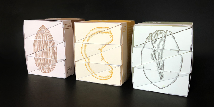
The illustrations of the side of each pack of six pods are rendered in beautifully detailed line work reminiscent of traditional illustration rather than modern unhealthy supermarket graphics. These illustrations separate into six panels, so with each box the consumer is left with only a part of the illustration, a quiet reminder that today is only one day on a much longer road to good health.
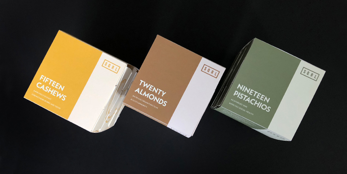
Our brand is named SQRL, a cheeky nod to nature’s original tree-dwelling nut aficionado. Graphically the two tone color scheme and modern sans serif typography deviate from most contemporary nut packaging. A walk down the supermarket nut aisle reveals bright colors and dancing cartoon nuts, all cues referencing nuts as a treat for ballgames or the circus. We tried to do something different. Our graphic system takes cues from the traditional apothecary, using graphic simplicity to allude to a world of health and nutrition. We still use bold colors, but the colors are taken from hues naturally found in each nut. The copy on the boxes suggests the powerful health benefits of regular consumption of each nut. Almonds are recognized for their effect on immunity and mental acuity. Cashews are celebrated for improving eyesight and strengthening both bones and teeth. And pistachios are subtly championed for their effect on skin and sexual health. Each design choice was made with the intention of being honest to the form, color, and nutritional benefits of the product.
We are three graduate students completing our final semester of the Master of Science in Package Design at Pratt Institute in Brooklyn. Stephanie, Hyeryun (also known as Henie), and Ian have
backgrounds in Industrial Design, Structural Packaging, and Environmental Science respectively, and it was an exciting opportunity to fuse these backgrounds into the 48-hour RePack Design Competition. Thanks for reading!

