Coke for the Community
Coke for the Community
| School: | University of Kansas |
| Team: | Alison Benz, Jordan Tull, Ramsey Carter, Webster Johnson, Zach Butenas |

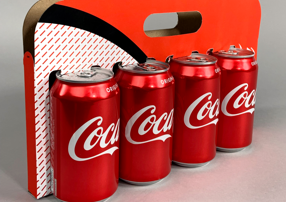
Coca-Cola has developed a playful and recognizable brand through their marketing efforts, and as we explored concepts for this competition, our group aimed to design a package that could capture Coca-Cola’s brand better than a standard box. The ‘Share a Coke’ marketing campaign served as inspiration for our process, and we created a new concept that highlights the classic red cans and could easily be shared for groups of people. Our design, ‘Coke for the Community,’ uses less cardboard and encourages sharing through the grab-and-go display of the cans.
Our process started by evaluating the design flaws of the current 12-pack box of Coca-Cola cans. Not only does the sharp, rectangular box counteract the design language of the fun Coca-Cola brand, but we also found that many users couldn’t easily access the last cans in the box. Cans would get shaken because they were free to roll around, and the box is difficult to breakdown- one user we interviewed even said she had gotten a cut on her hand while pulling apart the glue, trying to break down the box for recycling. The current box is also a set size- as the user drinks and removes cans from the box, it still takes up the same amount of space in the fridge. These were all problems that we wanted to solve for, in a way that keeps manufacturing as easy as it is now.
In our ideation sketches, we tried to problem solve the design flaws in the 12-pack while also focusing on the community aspect that Coca-Cola is so known for. Making the package more sustainable is just an example of how Coca-Cola embraces the community, and we wanted to explore more ways that the package could utilize sharing while minimizing waste.
The ‘Coke for the Community’ package we settled on solves the problems from the original 12-pack, and also creates a new marketing effort aimed for sharing. This design could easily be adapted for any number of cans between 4 and 12, and uses less material than the original cardboard box. We designed the packaging to be easily manufactured and cut from one sheet of cardboard. The current 12-pack box was appreciated for its dispenser-like opening that could serve cans easily, and our new design still does this, in a different and eye-catching way. The tear-away feature, that can split our package in half, reduces the space taken in the fridge as the user drinks the cans and further emphasizes the theme of sharing in our design. Through this 48-hour challenge, we were able to learn more about The Coca-Cola Company and explore different types of material for manufacturing ease.
