Outside the Box
Outside the Box
| School: | Virginia Tech |
| Team: | Krissa Rehberg, Makayla Sarkis, Michael Petras |
Sustainability and recyclability are two of the most prominent aspects in the packaging industry
today. Many raw materials are declining, making the use of several popular materials (such as
Low-Density Polyethylene) a less realistic option for packaging over time. Our design seeks to
replace the current LDPE Hi-Cone design with paperboard. This change promotes an
environmentally friendly and more widely recycled product alternative. In recycling plants,
paperboard can easily be broken down and reprocessed. On the other hand, LDPE often makes it
to recycling plants, but is not recycled due to a low number of buyers. All the extra plastic ends
up in landfills, where they stay and slowly photodegrade for up to a thousand years; however,
paperboard will biodegrade in under ten weeks.
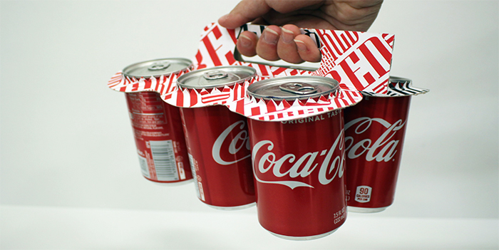
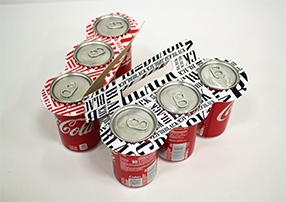
Our main design goals were to minimize paperboard use while still maintaining an ergonomic
feel. We found that we could easily make this new Hi-Cone replacement much more versatile by
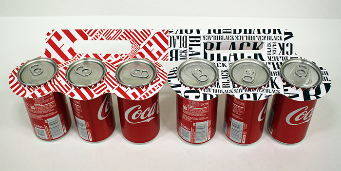
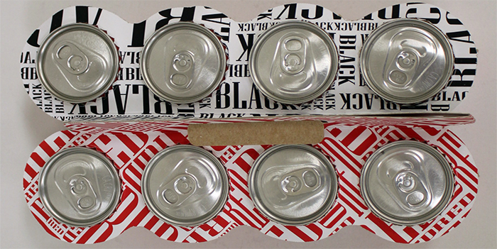
allowing it to unfold from its traditional 6-pack design. A perforation on the bending point
allows for easy separation into two smaller packs. Each 7.5 oz can is held by small paperboard
teeth and friction. The teeth increase both the area of contact with the can and the force of
friction it experiences. Additionally, the teeth push up on the small lip at the top of the can,
which allows for a resisting force to keep the cans from coming loose during transport. Our
handle provides a comfortable grip as well as structural support for the entire package. The tab
on the handle helps to hold the two halves of the design together and it also removes any need
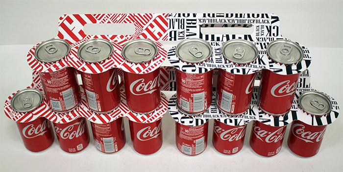
for adhesives. Additionally, the product uses the shape of the cans to allow for a stackable
feature, in which the handle helps in stabilizing stacked cans and preventing any fallings.
We decided to use the theme of unification for our graphical element. We used the words
“BLACK” and “RED” in their respective colors to form a unique pattern that catches the
consumers’ attention. Typography is used to create an intricate set of interlocking bolded words
that represent the coming together and clashing of different backgrounds. This concept could be
used for various sports events like the Olympics, hometown rivalries, and many other events
since the design has both a playful, yet competitive vibe. Because at the end of the day, sharing a
Coke is sharing an experience, and the Tear & Share Coke makes that a reality.