Minute Maid Juice Box
Minute Maid Juice Box
| School: | Portfolio Center |
| Team: | Danielle Tobin, Carolina Colombo, Kevin Diggs, Melanie Maynard |
The juice box aisle is full of unnecessary stresses with all the packaging being similar in
look and style. It is very chaotic for the consumer to find what flavor they want or need
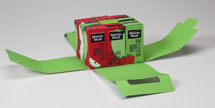
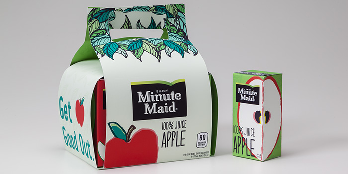
in a quick and convenient manner. When buying in bulk there is no handle, often times
awkward for the consumer to carry. One of the biggest pain points would be the
cellophane packaging of the straws. They are difficult to open, especially for young
children, and often get detached from the box, leaving the juice drinker frustrated and
having to look for an alternative to puncturing and drinking.
Our goal for MinuteMaid’s new packaging was driven by the desire to meet real human
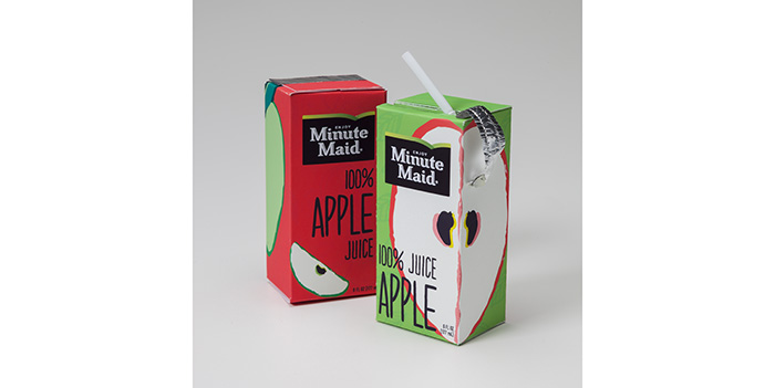
needs and to protect our environment. First we tackled the issues with the straw. As it
often gets lost and is hard to open, we decided to build it in as part of the container.
The straws upper portion lays nested inside a “valley” at the top of our reengineered
box. It is protected by an aluminum pull tab to keep it in a sterile condition. A non-toxic
rubber ring seals the straw in the valley portion to connect it to the juice box in order to
prevent leaks and spills. As an extra leak prevention step, a mini stopper is connected
to the aluminum pull tab that plugs into the straw hole. We chose to keep the classic
brick shape because of its stiffness, strength, as well as convenience of portability. It
can also be stacked easily and not waste any space when grouped together. Also, we
are keeping the material the same, as the aseptic cartons that package these
beverages have environmental benefits and are becoming more popular to use. With
the help of consumers and companies alike having sustainable packaging concerns,
the recycling rates of this material are rising. The aseptic container also plays an
important role in preserving the nutritional value and maintaining the quality of the juice.
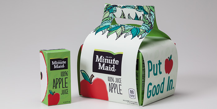
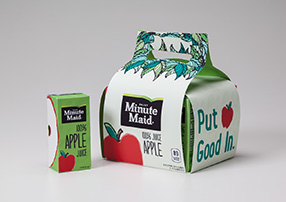
The thought process behind our juice box’s visual design was to create a hand done
aesthetic for a more approachable and kid friendly quality. We decided to create a
carrier with a handle for easier transportation. We slimmed down the amount of images
on the outside to reduce the visual chaos and make the primary fruit that’s in the
particular juice be the star of the show. Our color palette creates a bold yet unique look
that differentiates itself from others on the shelf. Our individual apple juice box design
has a full fruit image on one side and a sliced version on the other. We did a red and
green rendition so no apple variety gets left out.