The Portfolio Center
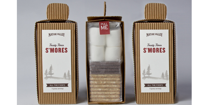
S'monsters S'mores Kit
| Team: | Preston Grubbs, Stewart, Caitlin Dupree, Jessica Gonzalez, Jess Ruiz, Erica Hines, Zach Rossman |
Our product is the S’monsters S’more Kit by Nabisco. We felt an instant connection with s’mores
out of all the other categories because it evoked excitement and a flood of childhood memories.
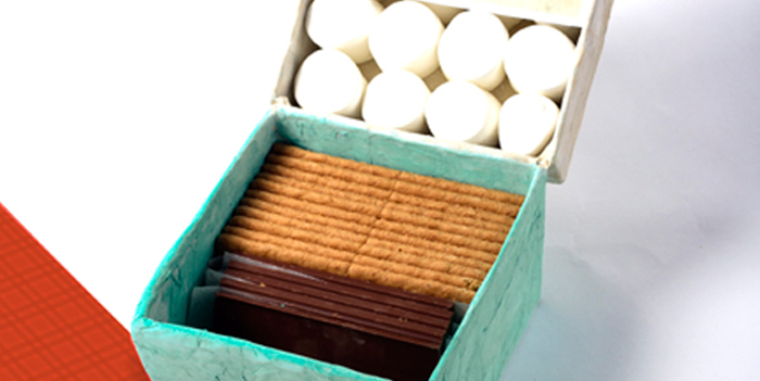
We saw this project as an opportunity to problem solve by repackaging these ingredients—the
graham crackers, chocolate and marshmallows—into a singular kit, thereby reducing the amount
of materials needed and waste created. Because the brief was centered around camping, we
wanted to make the packaging as condensed as possible and also disposable. We decided to
include four servings of two s’mores per box because it is an ideal quantity for a small family or
group of friends to enjoy without having excessive leftovers to deal with. It is produced with
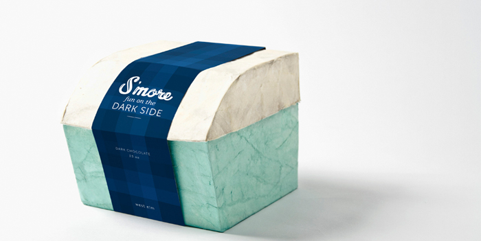
beeswax-coated paper and soy ink, and the dieline fits on a singular cut of material. At a
compact 2.5″ wide, 2.5″ deep and 6.25″ tall, it maximizes shelf space and cuts back on shipping
costs.
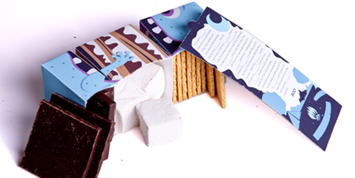
The package design was carefully thought out because we wanted to make it as functional as
possible. It has three separate compartments for the ingredients, which are stacked in square
form to optimize shelf space and visual presentation. We wanted to take the hassle out of the
process (i.e. breaking crackers unevenly or getting chocolate all over our hands while breaking
down the bar) so we used ingredients that were not only manageable, but also proportionate to
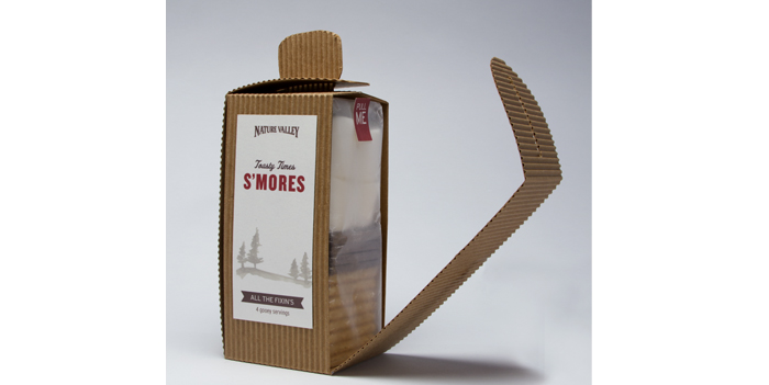
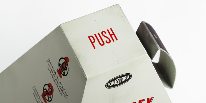
one another. We placed the opening on the back spine: a perforated tab at the top of the box
that can be pulled to open down the back for easy access to the compartments.
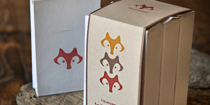
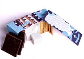
We based our design on those aforementioned feelings of nostalgia and happy memories of
sitting by the campfire, telling scary stories with family and friends. The idea of ghost stories
lead us to our monster theme. We felt they would be a playful figure to carry out our product line
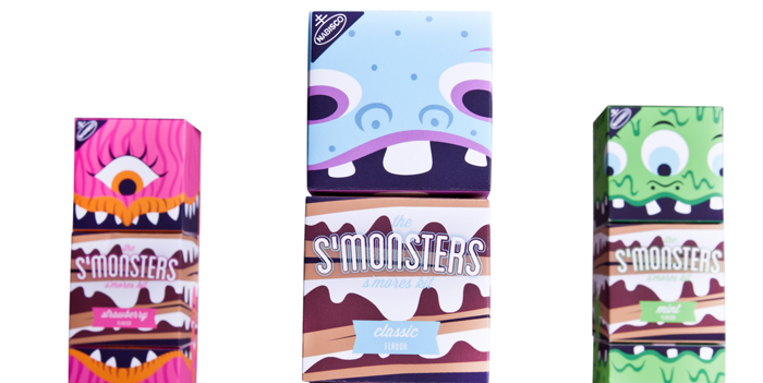
because we could make them colorful and create personas for each one. We narrowed it down
to three characters that were representative of three flavors—original, strawberry and mint—
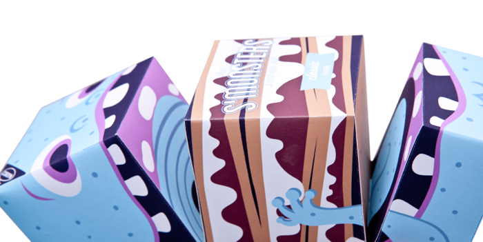
and colored each one accordingly. We felt the quirky name and bright colors would appeal to
kids, as well. The box has been decorated with original illustrations that are playful and
communicate the contents of the package. The vibrant designs and overall form of our product
also provide a strong shelf presence. We wanted to further connect the ideas of camping and
storytelling to our product and characters by including a Mad Lib within each box that would
engage the consumer. The last fun feature is the ability to use the package as a puppet once its
contents have been consumed, simply by using the back opening to operate the top and bottom
of the monster’s mouth. On the back’s exterior, we have included nutritional information as well
as a short bio about its respective character.
In the end, we successfully integrated the neccessary criteria for this project into our solution.
The S’monster S’more Kit is a smart and functional design that is also fun and whimsical for its
targeted demographic—kids will be drawn to the playful design and game aspect and parents will
be happy to keep their children occupied. We also designed our product visually with parents in
mind by keeping clean lines and simple illustrations, which give it a little bit of order and
sophistication. The S’monster S’more kit is constructed using eco-friendly material that is easily
disposable and cost effective, too.